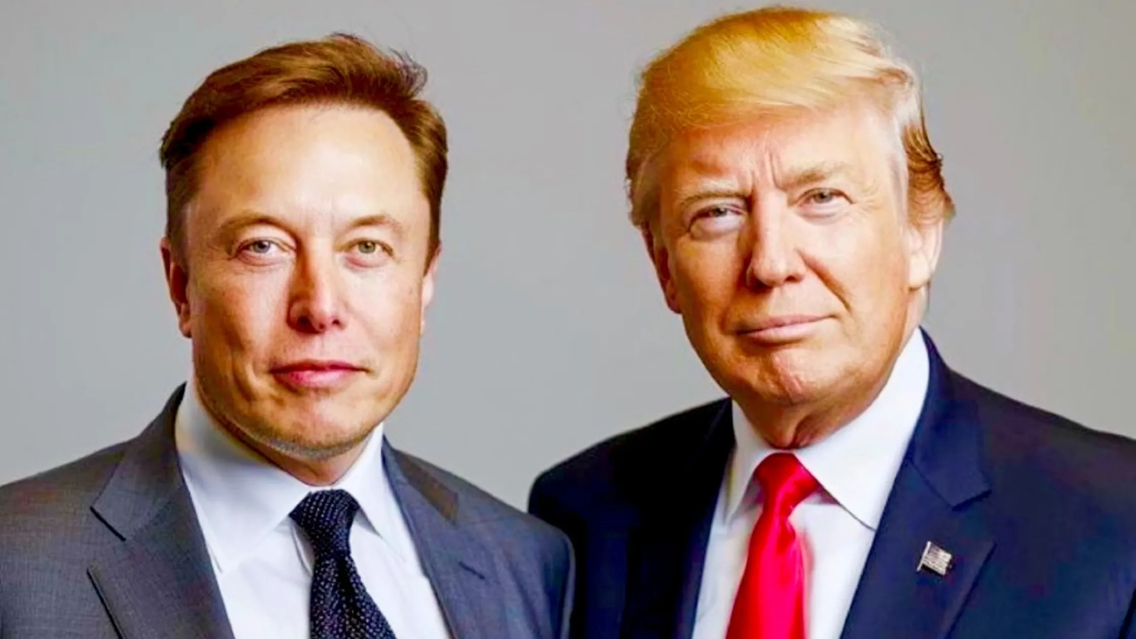
Elon Musk and Donald Trump—two names that dominate headlines, yet their relationship has always been a mix of collaboration, disagreements, and strategic positioning. With Trump eyeing a return to the White House, many are wondering: How could this impact Musk and his empire? From Tesla and SpaceX to X (formerly Twitter) and Neuralink, Trump’s policies could offer significant advantages to Musk’s businesses.
Pro-Business Policies: A Boon for Musk
Trump has always championed pro-business policies, advocating for reduced regulations and lower taxes as key elements of his economic agenda. This approach could significantly benefit Elon Musk, who runs several billion-dollar companies, including Tesla, SpaceX, and Neuralink. Musk, known for his innovative ventures in industries like electric vehicles, space exploration, and artificial intelligence, could see substantial advantages from a business-friendly administration. If Trump returns to office, the policies he favors could create an environment where Musk’s companies are able to grow even faster, navigate regulatory hurdles more easily, and keep more of their profits.
During Trump’s first term, the corporate tax rate was dramatically reduced from 35% to 21%. If this tax cut is reinstated, companies like Tesla and SpaceX would save billions in taxes. These savings could be reinvested in new technology, research and development, or even used to lower the cost of production. With such a financial cushion, Musk could expand operations at an accelerated pace, making further advancements in electric vehicles, space technology, and even exploring new sectors like AI or biotechnology. The tax savings could also provide a competitive edge, allowing Musk to continue to dominate in areas where innovation is the key to success.
Another area where Musk stands to benefit from Trump’s presidency is deregulation. Trump’s stance on reducing government oversight could help Musk’s companies thrive, as they operate in industries that are often burdened by heavy regulations. For example, Tesla, which has been involved in ongoing regulatory battles over safety standards, emissions, and autopilot features, could find it easier to launch new car models without being bogged down by government roadblocks. Similarly, SpaceX could see a faster approval process for satellite launches, rocket tests, and other space missions, enabling Musk’s company to keep ahead of competitors. Additionally, Neuralink, Musk’s brain-computer interface company, could gain more freedom in conducting human trials without the same level of scrutiny from regulatory agencies, allowing the company to accelerate its work on groundbreaking medical technologies.
With reduced interference from government agencies, Musk’s companies could continue to push the boundaries of innovation and lead their respective industries. Whether through tax cuts or deregulation, a pro-business environment under Trump’s leadership would be a significant advantage for Musk’s businesses, allowing them to focus on growth and innovation while navigating fewer obstacles.
SpaceX and the Military-Industrial Complex
SpaceX has already established strong relationships with the U.S. government, securing multiple contracts with agencies such as NASA and the Department of Defense. If Trump returns to the presidency, the relationship between SpaceX and the military-industrial complex could strengthen, leading to more opportunities for Musk’s company.
- Trump has historically supported strong military spending, and if this trend continues, it could lead to increased government contracts for SpaceX.
- SpaceX could see more satellite launch contracts awarded, further solidifying its position as a leader in space technology and satellite deployment.
- With Trump’s military priorities, SpaceX could receive funding for the expansion of Starlink, Musk’s satellite internet service, for military communication purposes, making it an integral part of national defense infrastructure.
- Trump’s focus on advanced weaponry and technology could result in increased investments in hypersonic missile technology, where SpaceX’s innovative capabilities could play a crucial role in developing cutting-edge defense systems.
- Musk’s long-standing dream of colonizing Mars aligns with NASA’s goals for deep space exploration. Trump’s previous push for lunar missions could continue to drive investment in space exploration.
- Under a Trump presidency, SpaceX may see more collaboration with NASA, leading to additional partnerships that could accelerate the development of technologies required for missions to Mars and beyond.
- With SpaceX’s Starship program aiming for Mars, a Trump administration could provide additional funding to help develop the spacecraft, advancing Musk’s vision of human settlement on Mars.
Tesla and the EV Industry Under Trump
| Policy/Action | Potential Impact on Tesla | Advantages for Tesla | Challenges for Competitors | Strategic Opportunity for Tesla |
| Reduced EV Subsidies | Trump is less supportive of EV tax credits compared to Biden, but this could work in Tesla’s favor. | Tesla’s established brand loyalty and infrastructure give it an edge. | Legacy automakers like Ford and GM may struggle without subsidies. | Tesla can rely on its existing customer base and strong infrastructure to stay ahead. |
| Legacy Automakers’ Struggles | Without subsidies, traditional automakers might face increased production costs and lower sales. | Tesla’s strong market position and innovation could make it even stronger. | Ford, GM, and other traditional car manufacturers may lose ground. | Tesla can capture more of the EV market as competitors struggle. |
| Tesla’s Competitive Edge | Tesla benefits from a well-established brand, charging infrastructure, and production capacity. | Tesla’s brand loyalty and existing infrastructure make it resilient. | Competitors would face difficulty replicating Tesla’s success without significant investment. | Tesla can continue to scale production and build more customer loyalty. |
| Imposition of Tariffs on Chinese EVs | If Trump imposes tariffs on Chinese-made EVs, Tesla’s U.S.-made vehicles would have an advantage. | Tesla would benefit from less competition from Chinese EV brands. | Chinese EV brands may struggle to enter the U.S. market due to tariffs. | Tesla can expand its U.S. market share by being a domestic manufacturer. |
| Trade Policies Favoring U.S. Manufacturing | Trump’s policies could include tariffs on Chinese-made products, including EVs, benefiting U.S. manufacturers. | Tesla, being an American company, could see a market boost. | Foreign EV manufacturers could face higher costs to compete in the U.S. | Tesla has the opportunity to grow faster in the U.S. market, capitalizing on trade policies. |
Social Media and X (Formerly Twitter)
Musk’s acquisition of X (formerly Twitter) has already sparked political debates, and under a Trump presidency, the platform could experience significant shifts. A more favorable regulatory environment for social media platforms could help Musk’s X thrive in ways that it might not under other administrations. Trump’s stance on free speech could align well with Musk’s vision for X, making it an even more attractive platform for users and advertisers alike.
If Trump were to return to office, X could benefit from a reduction in government regulation. While the Biden administration has pushed for stricter tech regulations, especially related to content moderation, Trump is more inclined to favor policies that champion free speech. This could mean a rollback of content moderation rules that have caused legal headaches for social media platforms like X. With fewer restrictions on speech and less scrutiny from regulators, Musk could steer X toward a more open platform, attracting a larger and more diverse user base. Furthermore, reducing government intervention would allow Musk to focus on growing X without having to constantly navigate legal battles surrounding censorship and content regulation.
Another potential benefit for X under a Trump presidency is the return of Trump himself to the platform. Trump was banned from Twitter before Musk’s acquisition, but his account was reinstated under Musk’s leadership. If Trump becomes an active user again, the platform could see a surge in engagement, with his followers flocking back to X to engage with his posts. This would boost ad revenue for X, which has struggled with monetization in the past. Trump’s presence on the platform could also bring in a wealth of content from his supporters, further increasing engagement and potentially attracting advertisers eager to target the political right.
Finally, a Trump-Musk partnership could reshape the landscape of conservative digital media. Both men have large followings and a significant influence over public discourse. Their collaboration could create a powerful voice in the digital media space, especially among conservative audiences. With Trump’s reach and Musk’s innovative platform, X could redefine the way political content is consumed, giving the right a dominant platform for communication and engagement. This partnership could position X as the go-to platform for conservative voices, influencing the future of social media and its role in political discourse.
AI and Neuralink: Looser Regulations?
Musk has expressed concern about the risks of artificial intelligence, but he is also heavily invested in AI projects like xAI. While Trump’s stance on AI regulation remains somewhat unclear, his general anti-regulation mindset could provide significant advantages for Musk’s ventures in AI and biotech.
- Easier AI Development Without Heavy Oversight:
- If Trump limits government oversight on AI, Musk’s AI projects could innovate at a faster pace without bureaucratic delays.
- Looser regulations could enable Musk to push the boundaries of AI without being hindered by strict ethical constraints that often slow down development.
- With less interference from government regulators, Musk’s AI ventures, including xAI, could quickly bring cutting-edge technologies to market, giving him a competitive advantage.
- Faster Human Trials for Neuralink:
- Neuralink, Musk’s brain-chip company, currently faces regulatory hurdles from the FDA that delay progress. Under a Trump administration, these hurdles could be reduced.
- Trump could apply pressure on regulatory bodies to expedite approval processes for new technologies, allowing Neuralink to move forward with human trials at a faster pace.
- By fostering an environment that encourages private-sector innovation in biotech, Trump could provide Neuralink with more freedom to test and implement its technologies without being bogged down by lengthy regulatory approval processes.
- A pro-business stance would help Musk’s companies in the rapidly developing fields of AI and biotech, enabling them to continue their ambitious projects.
Cryptocurrency and Financial Freedom
| Policy/Action | Potential Impact on Cryptocurrency | Advantages for Musk’s Crypto Ventures | Challenges for Crypto Competitors | Strategic Opportunity for Musk |
| Less Regulatory Pressure on Crypto | Trump’s preference for reduced regulation could mean less government scrutiny for crypto companies. | Musk’s crypto ventures could operate more freely without stringent regulations. | Crypto companies would have more room to innovate without constant legal obstacles. | Musk could expand his influence in the crypto space, promoting Dogecoin and Bitcoin on X. |
| Better Environment for Crypto on X | With fewer regulatory restrictions, X could become an even more attractive platform for crypto discussions and promotion. | Musk could use X as a powerful tool for promoting cryptocurrencies and attracting crypto communities. | Competitors may find it harder to gain traction in an environment that favors Musk’s platform. | Musk could solidify X as the central hub for cryptocurrency discussions and transactions. |
| Reduced Government Control Over Finance | Trump’s anti-regulation stance could reduce the control that government agencies like the SEC have over the financial sector. | With less government interference, the market could be more responsive to innovation and new crypto products. | Traditional financial institutions may feel threatened by the rise of decentralized finance. | Musk’s ventures could lead the way in the transition toward decentralized financial systems. |
| Promoting Financial Freedom | Trump’s policies could favor more decentralized financial systems, allowing cryptocurrencies to flourish. | Cryptocurrencies would benefit from a more open market with fewer restrictions. | The shift towards decentralization could disrupt traditional banking systems. | Musk could lead the charge in transforming finance with his advocacy for decentralized currencies. |
| Increased Adoption of Crypto | With less regulatory opposition, cryptocurrencies could gain more widespread adoption across various sectors. | Musk’s endorsement of crypto could accelerate adoption and use cases, especially with Dogecoin and Bitcoin. | The growth of cryptocurrencies could make it difficult for competitors to keep up. | Musk could continue to drive the global shift toward digital currencies, further cementing his influence. |
U.S.-China Relations and Its Impact on Musk’s Empire
Trump’s hardline stance on China could have significant implications for Musk’s companies, particularly Tesla. On one hand, policies that target China could present new opportunities, but they could also introduce risks that might disrupt Musk’s global operations. The potential for tariffs and trade tensions could impact Tesla’s production strategy, especially in regard to its operations in China and the U.S.
If Trump were to impose new tariffs on Chinese-made electric vehicles, Tesla’s production in the U.S. could benefit. Companies like BYD, which rely on China for production, could face increased costs, making it harder for them to compete in the U.S. market. Tesla, with its U.S.-based manufacturing, would be in a stronger position to capitalize on this shift, as the company could offer its vehicles without the added costs that come with tariffs. Additionally, a pro-American manufacturing policy could help further solidify Tesla’s position as a leading U.S. automaker, boosting its sales and market share.
However, escalating tensions between the U.S. and China could present significant challenges for Tesla’s operations in China, particularly at its Shanghai Gigafactory. If tariffs were increased on exports from China to the U.S., Tesla’s cost structure could be negatively affected, reducing profit margins for vehicles manufactured in Shanghai. Additionally, political risks could disrupt Tesla’s supply chains, as heightened political friction could lead to delays or restrictions on key materials and components that are sourced from China. These challenges could force Tesla to rethink its strategy in China, possibly shifting some of its production or supply chain operations to mitigate these risks.
Despite these potential obstacles, Musk’s ability to navigate geopolitical challenges has been one of his defining strengths. Tesla’s global presence and his innovative approach to business could help mitigate the risks associated with increased U.S.-China tensions. However, the landscape remains uncertain, and any significant shifts in U.S.-China relations could have a profound effect on Musk’s empire.